What Color Do You Need?

If you are designing a file or getting ready to send your artwork to be printed, you should understand the basic definitions of the colors being used and what the differences are. There are 4 basic color types: CMYK, RGB, PMS and HEX.

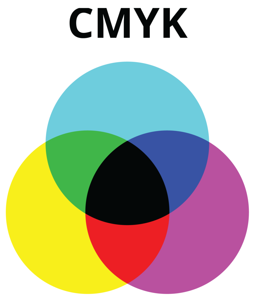
CMYK is also know as Full Color, Four Color, Four Color Process and Process Color. CMYK refers to the four inks used in printing full color… Cyan, Magenta, Yellow and Black.  

Each process color is comprised of percentages of cyan, magenta, yellow, and black inks that are printed in transparent dots of ink that blend together to make a color. CMYK printing will produce high quality results, but there is a chance of color variation across different printers and in different print runs. CMYK are the colors used when you send a file to your desktop printer or when you send a file to a printing company to be printed. CMYK cannot be used on a screen or online.

The best file formats for CMYK colors are: PDF, AI, EPS, orTIF; but a JPEG file can also be CMYK.


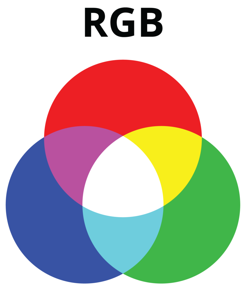
The RGB color model is an “additive color model” in which red, green, and blue light are added together in various ways to reproduce a broad array of colors.

RGB colors work great on websites and on-screen, but it is not a good choice for printing. RGB colors should be used for website logos or graphic images, social media, video, photographs online, apps, etc. You will notice that RGB colors appear more vibrant than CMYK colors because they are illuminated on a screen and the screen provides a larger range of color.

The best file formats for RGB colors are: JPEG, PNG and GIF.


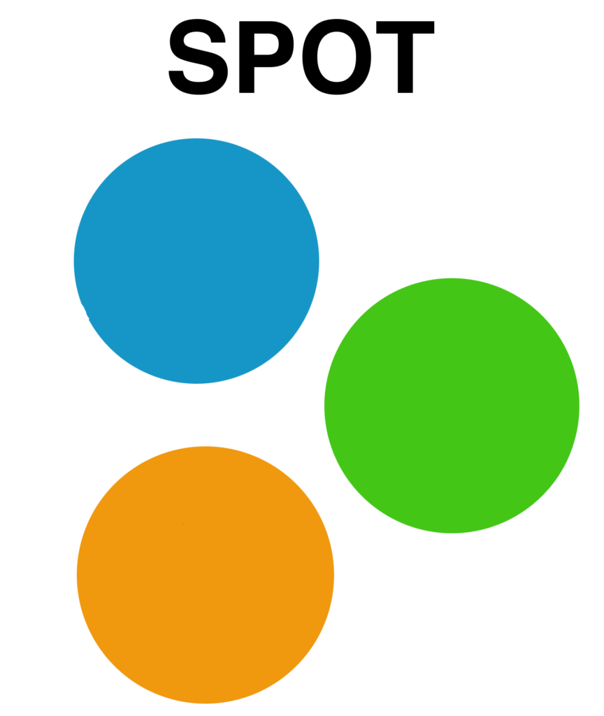
A spot color is a special premixed ink that is used instead of, or in addition to, process inks (CMYK).

Spot colors are solid colors of ink. A spot color requires its own printing plate on a printing press which adds to the cost of the printing job. You would use spot color when color accuracy is critical. There are several spot color systems to choose from, but the most widely used is the Pantone Matching System (PMS).


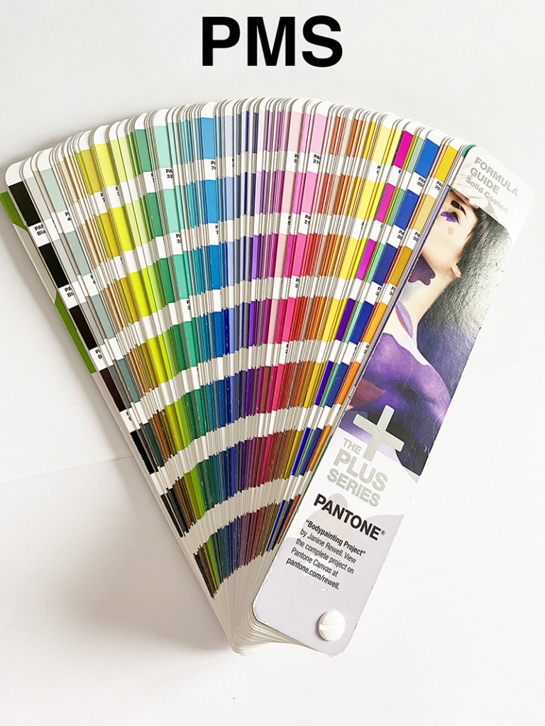
Pantone Matching System (PMS) is a printing industry color matching system used to print spot colors – also called Pantone colors.

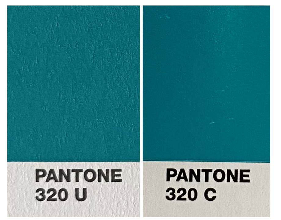
Pantone uses 18 base colors to create a range of Pantone colors. The swatches are indicated by a three- or four-digit number followed by the letter C or U. (example PMS 320C) The C stands for Coated and the U for Uncoated and refers to the finish of the paper it is being printed on. Coated are used for printing on glossy surfaces and Uncoated for printing on matte surfaces like letterhead. When you print on a coated surface it adds a sheen to the ink and the uncoated inks are not as vibrant. If you look at the same PMS number in coated and uncoated, there is a noticeable difference.


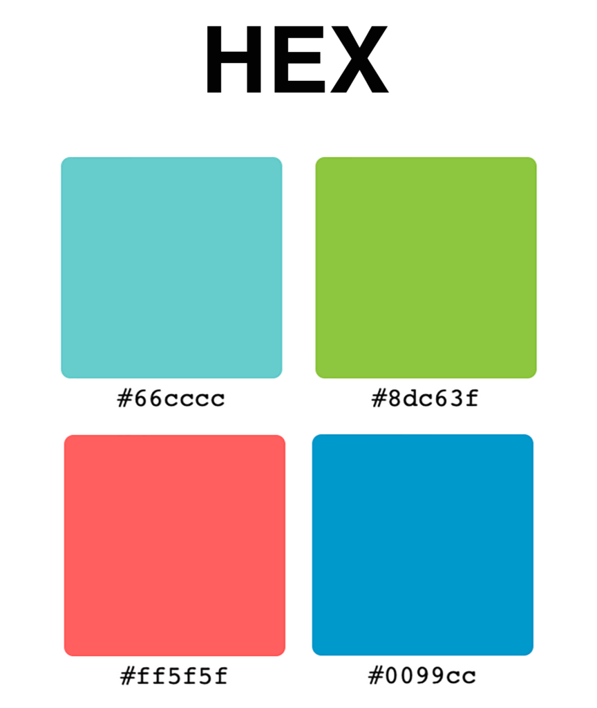
Hex Colors are Hexadecimal numbers are used on web pages to set colors.

Hex colors are a mix of red, green and blue (RGB) with some conversions. The color is shown by the number sign (#) followed by six letters, numbers or a combination (ex. #66ccc). Hex colors are only used on web pages and should not be used in designing for print.

Most likely, you will never need to use hex color codes, but, you can find free conversion tools online if you need to convert RGB files to HEX by searching, “RGB to HEX” .

Know the Facts…The True Cost of the $9.99 Business Card

Do you really understand what you are getting?

There are always 3 things to consider when making any type of purchase – QUALITY, SERVICE and PRICE. You won’t always get all three, so you need to decide which 2 are the most important to you.

  • QUALITY – they look nice, but if you choose to design your cards and other items on their site using their designs it is just that, THEIR DESIGN. That is a problem because…
  • These are stock designs – Anyone else can choose the same design including your competition – your business will not stand out when others have the same look
  • You do not own the design or the logo you created on their site. Everything done on the site belongs to THEM – you can only use the design on items you purchase from THEM. If they don’t offer an item you are interested in – you cannot put their image on it.
  • When you order the “FREE” business cards, they put their name on the back and say “These cards are printed free courtesy of…” Do you really want potential clients to know that you don’t have enough confidence in your business to invest in printing business cards? Your business cards are the least expensive form of advertising there is – and they are also the most important piece of advertising you have!

When you purchase a logo or a design from Handouts – it belongs to you. Please always verify with your designer that the designs are yours before they do the design.

  • The design belongs to YOU. You can use it on anything you choose. You can build your company image around that design.
  • It will be a design created for you and not shared with others.
  • Your competition will not have access to the same design

SERVICE – if you need to contact someone at the online company, you will speak with the person that answers the phone, there is no personal service. When working with a local company…

  • You receive personal service
  • You are supporting a local business
  • Your design will be carried through all of your marketing pieces
  • If you want a specific promotional item or a direct mail or EDDM piece it can be handled through the same company

PRICE – the $9.99 business cards are rarely ever $9.99 once you add in for all of the extras.

  • We can’t speak for the printing price from other companies, but at Handouts ALL of our printing prices are very competitively priced with online companies at 500 pieces, and at 1000 and higher, we are actually less expensive with better quality AND your designs will be carried through all of your marketing.

Now you know some important facts that you should consider when thinking about purchasing your printed marketing pieces and how it will effect your other maketing pieces.

If you have any questions, please don’t hesitate to contact us. We would love the opportunity to provide you with a competitive quote on any of your marketing needs! We want to help you grow your business!

5 Tips to a Good Design

Graphic design is the process of visual communication to capture and engage viewers, generate interest or get a message across. A good design will make you feel something, compel you to read it or draw your attention. Make sure you have at least 3 of the fivethe following elements in your design.

1. Is there a focal point

The focal point is the main thing that you want the viewer to see, feel or understand. The following elements can be used to create a focal point: Size, Color, Framing or by Isolating. Isolation is separating the element from the rest of the design which brings focus to it.

2. Make sure your fonts work well together

For most designs, choosing one serif font and one sans-serif font is a good starting point.

• Never us a headline or script font or all caps for the text area of your design.
• Make sure all of your text is readable
• Use fonts that are clean and easy to read, especially for the body copy
• Size of the font is very important – make sure it is readable, but not too large
• If there is a background, make sure your font can still be easily read

3. Color and contrast

Color is a significant part of design, it dictates the mood and feel of the piece you are designing. Make sure your colors add interest, but do not fight with each other. A good rule of thumb is to consider colors that appear directly opposite or beside each other on the color wheel. Contrast is important because it draws the most important elements out and adds emphasis to them.

4. Good use of space

The parts of your design that you leave blank are just as important as the parts you fill. White space gives your design some breathing room it can also add interest if used correctly. If there is not enough, it looks crowded and hard to read, if there is too much, your design elements lose their relationship with each other.

5. Texture

Although you cannot feel texture in a printed piece or on a computer screen, the appearane of texture can add to your design. This can be accomplished using graduated color, layers, lines or shapes.

A good design is the key to getting your piece read, your brand recognized and your information remembered! If you need help, contact Handouts …WE DO THAT!