5 Tips to a Good Design

Graphic design is the process of visual communication to capture and engage viewers, generate interest or get a message across. A good design will make you feel something, compel you to read it or draw your attention. Make sure you have at least 3 of the fivethe following elements in your design.

1. Is there a focal point

The focal point is the main thing that you want the viewer to see, feel or understand. The following elements can be used to create a focal point: Size, Color, Framing or by Isolating. Isolation is separating the element from the rest of the design which brings focus to it.

2. Make sure your fonts work well together

For most designs, choosing one serif font and one sans-serif font is a good starting point.

• Never us a headline or script font or all caps for the text area of your design.
• Make sure all of your text is readable
• Use fonts that are clean and easy to read, especially for the body copy
• Size of the font is very important – make sure it is readable, but not too large
• If there is a background, make sure your font can still be easily read

3. Color and contrast
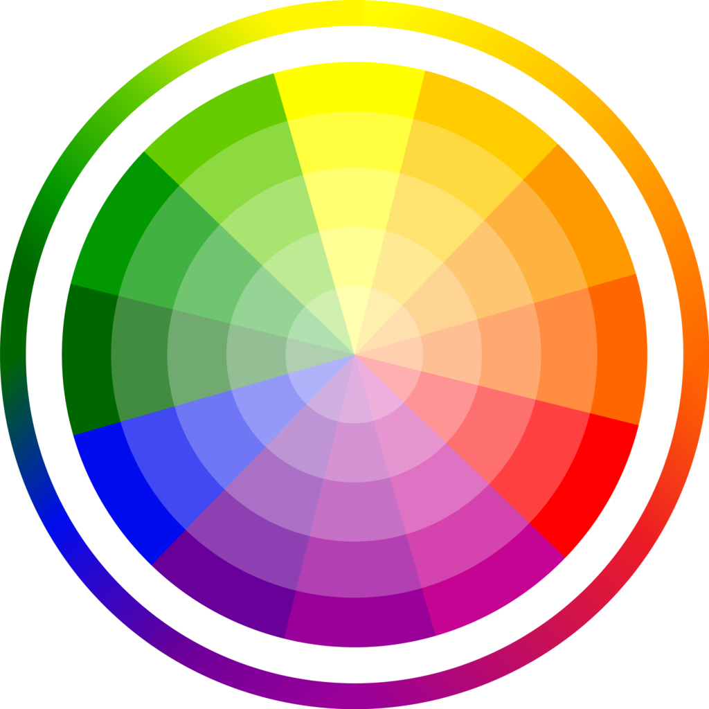
Color is a significant part of design, it dictates the mood and feel of the piece you are designing. Make sure your colors add interest, but do not fight with each other. A good rule of thumb is to consider colors that appear directly opposite or beside each other on the color wheel. Contrast is important because it draws the most important elements out and adds emphasis to them.

4. Good use of space

The parts of your design that you leave blank are just as important as the parts you fill. White space gives your design some breathing room it can also add interest if used correctly. If there is not enough, it looks crowded and hard to read, if there is too much, your design elements lose their relationship with each other.

5. Texture

Although you cannot feel texture in a printed piece or on a computer screen, the appearane of texture can add to your design. This can be accomplished using graduated color, layers, lines or shapes.

A good design is the key to getting your piece read, your brand recognized and your information remembered! If you need help, contact Handouts …WE DO THAT!
Let’s Start With the Basics!

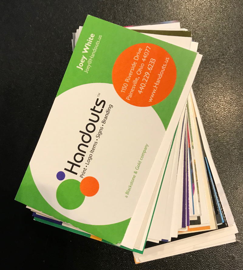
Take out your business card. Look at it…

Really look at it, objectively, as someone who doesn’t know anything about you or your company, as if you have never seen it before. Feel it, really study it.

Look at the quality of the paper. Does it clearly state the name of your company, who you are and what you do? Look at the design, is it professional?

Does it clearly state the name of your company, who you are and what you do,
is printed on quality paper, is the design professional, clean and easy to read?

As your first impression, is this a company you would entrust with your business?

If yes, congratulations, you are off to a great start in marketing your company!
If not, you need to make a change – RIGHT NOW!

Business cards are the most inexpensive yet important investment you can make in your business. Business cards cost pennies and many times are the first impression someone has about your company…make it the right one!

Tip #1 Make sure all of the information correct. Please, never ever hand write changes on your business cards, it tells people that you are not willing to invest even a small amount in your company. Don’t let a company give you free cards so they can put their advertisement on your cards. When the back of the cards say “ this card printed free courtesy of___” it show that you don’t have enough confidence in your business to invest in business cards…so why should the person you just handed the card have confidence in you?

Tip #2 Design
Carry the design of your business cards throughout all of your print and promotional items to build your corporate image.

If you need help, contact us for a free half hour consultation.

How to Get Your Mailings Read

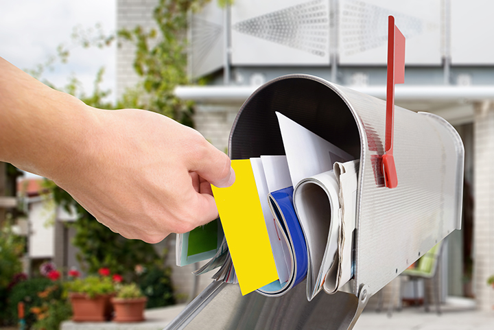
At Handouts we work hard to get you recognized and remembered and a great way to do that is to think outside the box when it comes to your Direct Mail Campaign after all, if no one is reading your material no one is responding to it! Here are a few tips to help you get your marketing materials read:

Use color!

People are bombarded by advertisements from the moment their alarm goes off in the morning, you need to make sure your materials cut through some of that clutter and get you noticed! You may have beautiful marketing materials, but if you mail them in a plain old white envelope with black print all your clients and perspective clients will see is junk mail. Besides if you are paying to print the envelope anyway why not use it to its full potential. The price difference to print the back of the envelope is very minimal especially when you take into consideration that it is another opportunity to make an impression on your clients. Add customer testimonials, your companies tagline, an interesting statistic about your company…you are only limited by your imagination.

Add a promotional product to your mailings. People will almost always open a three dimensional envelope just to see what’s inside. According to the Direct Marketing Association (DMA), the response rate for dimensional mailing outperforms all other types of direct marketing.

  • Letter size mailer to a house list 4.28%
  • Pay to Click Advertising 5.27%
  • Email Marketing 7.26%
  • Dimensional Mailing 8.51% to 30%

With almost 1 million products to choose form Handouts can help you find the perfect fit for your budget.

Choose the right type of printed piece. Depending on your mailing needs a postcard may be a better option for you than something in an envelope. Full color postcards are very inexpensive and the advantage of mailing a postcard is that everyone that comes in contact with it sees your logo and your message, there is no envelope barrier for them to get through. A full color oversize postcard is especially good at grabbing people’s attention.

Consider sending standard (bulk rate) or every door direct to save money. You can supply the mailing list or you can tell us who you want to reach and we can supply a mailing list to meet your demographics. Whatever your mailing needs at Handouts…We Do That!